EDA 4-plots in python
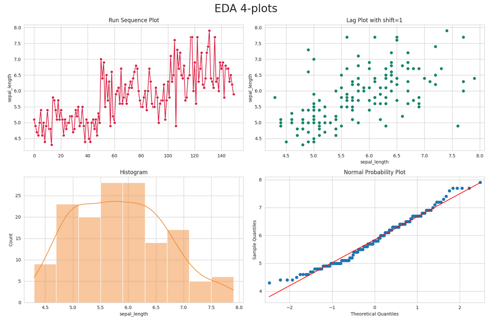
The 4-plot comprises four distinct exploratory data analysis (EDA) graphical methods designed to assess the underlying assumptions of most measurement procedures. It includes the following components:
- Run sequence plot
- Lag plot
- Histogram
- Normal probability plot
Here is a brief about each of the four components of a 4-plot: Run Sequence Plot: A run sequence plot is a graphical representation used in exploratory data analysis (EDA) to display data points in their sequential order. It helps identify trends, shifts, or patterns in the data over time. It is particularly useful for detecting outliers and assessing the stationarity of time series data.
Lag Plot: A lag plot is a type of scatterplot used to visualize the relationship between a data point and a previous data point (lagged by a certain time period). It is mainly used in time series analysis to assess autocorrelation, which is the correlation of a series with a delayed version of itself. Lag plots help in identifying patterns and dependencies within time series data.
Histogram: A histogram is a graphical representation of the distribution of data, showing the frequency or count of data points within specific intervals or bins. It provides insights into the shape and spread of the data distribution, highlighting whether it is symmetric, skewed, or bimodal. Histograms are useful for understanding the data’s central tendency and variability.
Normal Probability Plot (Q-Q Plot): A normal probability plot, also known as a quantile-quantile (Q-Q) plot, is used to assess whether a dataset follows a normal (Gaussian) distribution. It compares the quantiles of the observed data to the quantiles of a theoretical normal distribution. If the points on the plot approximately align with a straight line, it suggests that the data follows a normal distribution. Deviations from the line indicate departures from normality.
Here is a simple example using iris dataset.
import seaborn as sns
import matplotlib.pyplot as plt
import statsmodels.api as sm
import numpy as np

%matplotlib inline

# Load the Iris dataset
iris = sns.load_dataset("iris")

# Set the style of the plots
sns.set_style("whitegrid")

# Create the subplots and add plots to each
fig, ax  = plt.subplots(2,2, figsize=(15, 10))
fig.suptitle('EDA 4-plots', fontsize=24)

# Create a Run Sequence Plot
sns.lineplot(data=iris['sepal_length'], color='#db2547', marker='o', ax = ax[0,0])
ax[0,0].set_title('Run Sequence Plot')

# Create a lag plot
sns.scatterplot(x=iris['sepal_length'].shift(1), y=iris['sepal_length'], marker='o', s=50, color='#1a876c',  ax = ax[0,1])
ax[0,1].set_title('Lag Plot with shift=1')

# Create a histogram
sns.histplot(data=iris, x='sepal_length', kde=True, color='#f2903f', ax = ax[1,0])
ax[1,0].set_title('Histogram')

# Create a normal probability plot (Q-Q Plot)
sm.qqplot(iris['sepal_length'], line='s', ax = ax[1,1])
ax[1,1].set_title('Normal Probability Plot')

fig.tight_layout()

# Show the plots
plt.show()
The plot will look as following:
Use of 4-plots EDA
4-plots are valuable tools that can answer several key questions in data analysis and quality control:
- Randomness: Are the data points indicative of randomness, or do they exhibit patterns or dependencies?
- Process Control: Are the data points indicating that the process is in control, stable, and predictable over time?
- Location Drift: Is the process drifting concerning its central location (e.g., mean or median)?
- Variation Drift: Is the process drifting concerning its variation (e.g., standard deviation)?
- Serial Dependence: Are there correlations between adjacent observations, especially in time series data?
- Distribution Fit: Does the data follow a normal distribution, or does it adhere to another distribution?
- Outlier Detection: Are there any outliers in the data that may require special attention or investigation?